One of my favorite systems at work officially launched a couple weeks ago as Azure Data Explorer (internally called Kusto). I’ve been doing some blogging for their team on their Tech Community site. You can see all my posts on my profile page. This post will use Azure Data Explorer too but I thought it fit better on this blog.
A year or two ago, our local water company replaced all of the meters with digital, cellular meters. I immediately asked if that meant we’d get access to more data and they said it was coming in the future. The future is now! If you happen to live in Woodinville, you can get connected with these instructions.
The site is nice and lets you see charts, but by now you probably know that I love collecting data about random things so I immediately tried to figure out how to download the raw data. The only download directly supported form their site is the bi-monthly usage from the bills, but from the charts, I could see that hourly data was available somewhere. A little spelunking in the Chrome dev tools revealed the right REST endpoint to call to get a big JSON array full of the water usage for every hour in the last ~11 months.
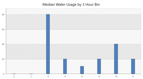
I pulled that into Azure Data Explorer and started querying to see what I could learn. This first chart shows the median water usage by three hour chunks of the day. Tyla and I usually both shower in the morning so it makes sense that 6-9am has the heaviest usage.
WaterUsage
| summarize
    sum(Gallons)
    by Hour=bin(hourofday(Timestamp), 3), bin(Timestamp, 1d)
| summarize percentile(sum_Gallons, 50) by Hour
| render columnchart  with (title = 'Median Water Usage by 3 Hour Bin', legend = hidden)
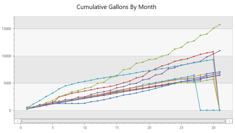
I feel like there’s probably a better way to do write the next query, but this works. It’s the cumulative usage throughout each month. The four lines at the top of the chart are the summer months when I’m using the irrigation in the yard. The lines that drop off at the end of the month are because I ran the x axis all the way from 1 to 31 for every month so months don’t have enough data, but it still conveys the general idea. It’s interesting how similar all the non-watering months are.
union
(
WaterUsage
| summarize Gallons=sum(Gallons) by bin(Timestamp, 1d)
| extend Month=monthofyear(Timestamp), Day = dayofmonth(Timestamp)
),
(
datatable(Timestamp:datetime, Gallons:long, Month:long, Day:long)
[
datetime(2018-11-26T00:00:00.0000000Z), 0, 11, 26,
datetime(2018-11-27T00:00:00.0000000Z), 0, 11, 27,
]
)
| order by Timestamp asc
| serialize MonthlyWater=row_cumsum(Gallons, Month != prev(Month))
| project Month, Day, MonthlyWater
| make-series sum(MonthlyWater) on Day from 1 to 32 step 1 by Month
| render linechart with (ycolumns = sum_MonthlyWater, series = Day, Month, legend=hidden, title='Cumulative Gallons By Month')
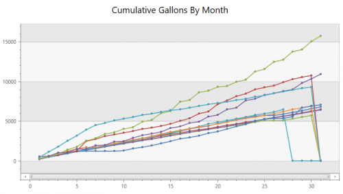
The data is in 10 gallon increments so it’s not super precise but it’s a LOT better than the two month resolution I had previously. I’m excited to play around with this data and see if we can start decreasing our usage.
Along these same lines, I heard that the local power company is starting to install power meters with Zigbee connectivity so there’s a chance that I’ll be able to start getting more insight into my power consumption in a similar fashion…