
Microsoft recently announced quarterly results and they were very good. I started thinking about how much the revenue has increased over the years and how many more employees there are. How has the revenue per employee changed?
Some quick searching revealed that this is a pretty common metric to track when investing, but I couldn’t find good, free data going back far enough to satisfy me. So I pulled the data together myself. This is NOT very reliable or accurate! Specifically, many of the employee count numbers were estimated from a chart image. Don’t make any investment decisions from this chart. That being said… it’s interesting to see that when you factor in inflation, Microsoft gets roughly the same amount of revenue per employee every year. Toss in a bunch of new employees and print more money. It’s a pretty good setup!

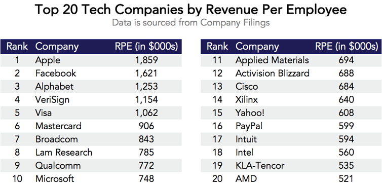
How does this stack up against other companies? Credit to zerohedge.com for the chart below:
This Visual Capitalist infographic shows revenue per employee for various sectors and companies you probably recognize.
I wonder what would happen if you walked into HR with these numbers in hand to talk about your salary? Good luck with that.